

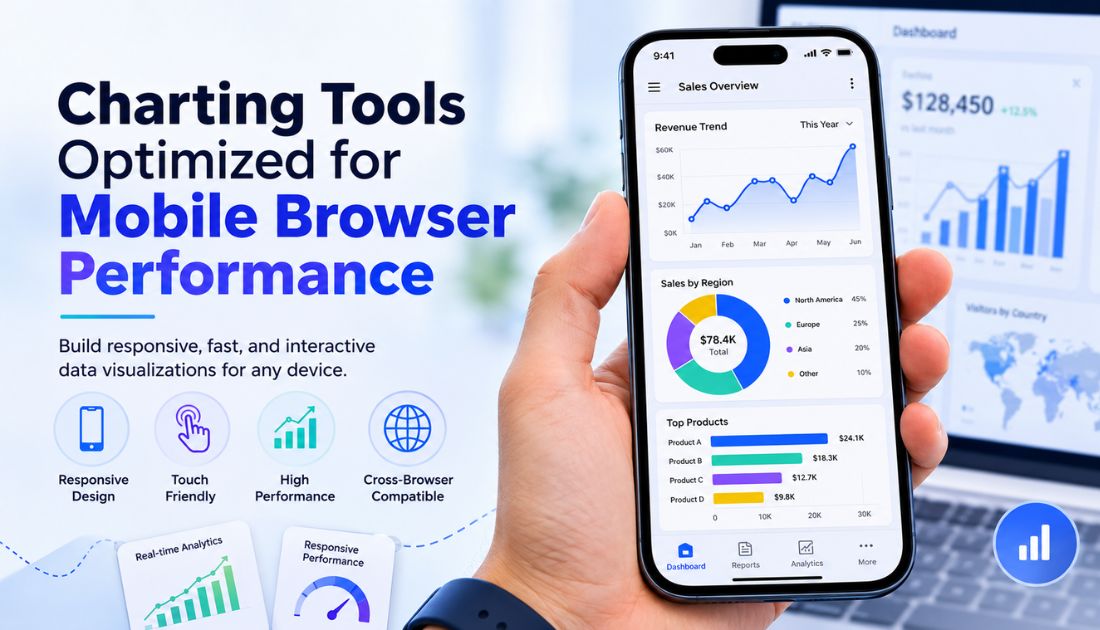
Mobile devices have become the primary way people access business applications, dashboards, and reports. Sales teams review performance on the go, executives monitor KPIs during meetings, and managers rely on real-time insights from their smartphones and tablets.
As mobile usage grows, users expect dashboards to be just as responsive as desktop applications. Charts should load quickly, adapt to different screen sizes, and support smooth touch interactions without sacrificing clarity.
Meeting these expectations requires more than responsive layouts. Developers need mobile charting tools that deliver fast rendering, efficient resource usage, and consistent performance across modern mobile browsers. Choosing the right solution helps create responsive, interactive dashboards that provide a seamless experience on any device.
Why Mobile Browser Performance Matters for Data Visualization
Performance is a key factor in the success of mobile data visualization. Slow-loading dashboards or laggy interactions can frustrate users and reduce engagement, especially when quick decisions depend on real-time information.
Several factors make mobile performance essential:
- Growing mobile usage: More users now access analytics and business applications from smartphones and tablets.
- Mobile-first development: Modern web applications are expected to work seamlessly across all screen sizes.
- Fast user experiences: Users expect mobile charts to render instantly and respond smoothly to touch gestures.
- Better user experience: Faster loading and responsive interactions contribute to improved usability and align with web performance best practices, including Core Web Vitals.
- Higher engagement: Responsive dashboards encourage users to explore data rather than abandon slow or unresponsive pages.
Optimizing JavaScript charts for mobile ensures users can access insights quickly, regardless of their device or network conditions.
Challenges of Rendering Charts on Mobile Browsers
Building high-performance mobile-friendly charts presents several technical challenges that developers must address.
- Limited device resources: Smartphones have less CPU power and memory than desktop computers, making complex visualizations more demanding.
- Smaller screens: Charts must remain readable while adapting labels, legends, and layouts to limited screen space.
- Touch-based interaction: Mobile users expect intuitive gestures such as tap, swipe, pinch-to-zoom, and pan instead of mouse-based controls.
- Large datasets: Rendering thousands of data points can affect both performance and readability.
- Network variability: Slow or unstable mobile connections can delay dashboard loading if data isn’t optimized.
- Cross-browser compatibility: Charts should perform consistently across Chrome, Safari, Edge, Firefox, and other mobile browsers.
Addressing these challenges requires a responsive chart library that combines efficient rendering, adaptive layouts, and touch-friendly interactions to deliver a smooth mobile experience.
Features of a Mobile-Optimized Charting Tool
Not all charting libraries are designed for mobile performance. When evaluating mobile charting tools, look for features that improve both usability and rendering efficiency across smartphones and tablets.
Responsive layouts
A quality responsive chart library should automatically adapt charts to different screen sizes and orientations. Responsive layouts ensure charts remain readable without requiring separate mobile and desktop implementations.
Touch-friendly interactions
Unlike desktop users, mobile users interact through taps, swipes, and pinch gestures. The best mobile chart library supports intuitive touch interactions such as tooltips, zooming, panning, and data selection.
High-performance rendering
Efficient rendering is essential for smooth interactions. A lightweight rendering engine minimizes CPU and memory usage, helping charts load faster and remain responsive even on lower-powered devices.
High-DPI display support
Modern smartphones feature high-resolution displays. Mobile-friendly charts should render crisp text, icons, and graphics without appearing blurry on Retina and other high-DPI screens.
Lazy loading
Loading every chart at once can slow down dashboards. Lazy loading renders visualizations only when they become visible, reducing initial load time and improving perceived performance.
Accessibility
Accessible charts benefit all users. Features such as keyboard navigation, screen reader support, sufficient color contrast, and descriptive labels help make mobile data visualization more inclusive.
Exporting capabilities
Many business users need to download or share reports. Built-in export options for images, PDFs, or printable views allow users to capture insights directly from their mobile devices.
Adaptive labels
Labels and legends should automatically adjust to smaller screens by wrapping, truncating, rotating, or hiding less important information to maintain readability.
Cross-browser compatibility
A reliable charting library should deliver consistent performance across major mobile browsers, including Chrome, Safari, Firefox, Edge, and Samsung Internet, without requiring browser-specific customization.
Best Practices for Mobile Data Visualization
Choosing the right charting library is only part of the solution. Following proven design and performance practices helps create dashboards that remain fast and easy to use on mobile devices.
Keep dashboards simple
Focus on the most important KPIs instead of displaying every available metric. Breaking complex dashboards into multiple views often improves usability.
Choose the right chart types
Simple visualizations such as line, bar, column, and area charts are generally easier to read on small screens than dense or highly detailed visualizations.
Reduce visual clutter
Limit unnecessary labels, gridlines, colors, and decorative elements. A clean interface helps users understand data more quickly.
Display only relevant data
Showing every available data point can reduce performance and overwhelm users. Display summary information first, with drill-down options available when needed.
Load data progressively
Rather than loading an entire dataset upfront, retrieve additional information as users scroll, zoom, or request more detail. Progressive loading improves responsiveness.
Optimize API requests
Reduce response sizes by requesting only the data required for the current view. Pagination, filtering, and server-side aggregation can significantly improve loading times.
Compress datasets
Compressing API responses and minimizing payload sizes reduces network usage, particularly for users on slower mobile connections.
Use responsive containers
Place charts inside flexible containers that automatically resize based on available screen space to maintain a consistent layout across devices.
Limit unnecessary animations
Animations can improve visual appeal but may affect performance on lower-powered devices. Use them sparingly and disable complex transitions when responsiveness is a higher priority.
SVG vs. Canvas for Mobile Charts
SVG and Canvas are the two primary rendering technologies used by modern JavaScript charts for mobile. Each has strengths depending on the application’s requirements.
| Feature | SVG | Canvas |
| Rendering | Vector-based | Pixel-based |
| Best for | Business dashboards | Very large datasets |
| Interactivity | Excellent | More complex to implement |
| Accessibility | Strong | Limited |
| Scalability | Crisp at any resolution | Resolution-dependent |
SVG
SVG is well suited for interactive business dashboards because each chart element remains an individual object within the browser.
Advantages
- Crisp graphics on all screen resolutions
- Better accessibility for screen readers
- Rich interactivity with tooltips and events
- Well suited for responsive business dashboards
Limitations
- Performance may decrease when rendering extremely large datasets with thousands of elements.
Canvas
Canvas draws graphics directly onto a bitmap, making it highly efficient for rendering large numbers of data points.
Advantages
- Excellent performance for large datasets
- Fast pixel-based rendering
- Lower rendering overhead for highly complex visualizations
Limitations
- Building advanced interactivity requires additional development effort.
- Accessibility support is more limited because chart elements are not individually represented in the DOM.
Neither technology is universally better. SVG is often the preferred choice for interactive business dashboards that prioritize accessibility and user interaction, while Canvas is better suited to applications that need to visualize extremely large datasets. The best mobile charting tools choose the rendering approach that best matches the application’s performance, interactivity, and accessibility requirements.
Evaluating Mobile Charting Tools
When comparing mobile charting tools, consider more than the number of available chart types. The right library should balance performance, developer experience, and long-term maintainability.
Key evaluation criteria include:
- Performance: Fast rendering and smooth interactions on smartphones and tablets.
- Responsiveness: Automatic adaptation to different screen sizes and orientations.
- Documentation: Clear guides, examples, and API references that reduce development time.
- Framework support: Compatibility with popular frameworks such as React, Angular, Vue, and TypeScript.
- Accessibility: Support for keyboard navigation, screen readers, and accessible visualizations.
- Commercial support: Professional support and regular updates for production applications.
- Maintenance: An actively maintained library with frequent bug fixes and improvements.
- Licensing: A licensing model that aligns with your project’s requirements.
- Community: Strong community adoption, tutorials, and third-party resources.
- TypeScript compatibility: Well-maintained type definitions that improve developer productivity.
Evaluating these factors helps ensure the chosen library continues to meet your application’s needs as it grows.
Popular Mobile-Friendly Charting Libraries
Several modern libraries provide excellent support for mobile charts and responsive web applications. Each has strengths depending on your project requirements.
| Library | Mobile Support | Enterprise Features | Best Suited For |
| FusionCharts | Excellent | Extensive | Business dashboards and enterprise analytics |
| Highcharts | Excellent | Extensive | Interactive business applications |
| Apache ECharts | Excellent | Good | Large-scale data visualization |
| Chart.js | Good | Basic | Lightweight dashboards and simple charts |
| ApexCharts | Good | Moderate | Modern web applications |
| AnyChart | Excellent | Extensive | Enterprise reporting and analytics |
When comparing libraries, consider factors such as:
- Mobile responsiveness: Automatic resizing and touch-friendly interactions.
- Interactivity: Support for tooltips, drill-downs, zooming, and panning.
- Enterprise features: Availability of advanced chart types, maps, Gantt charts, exporting, and accessibility.
- Dashboard capabilities: Ability to support complex, multi-chart analytics applications.
- Learning curve: Simplicity of the API, documentation quality, and ease of integration.
- Commercial support: Availability of long-term maintenance, professional support, and product updates.
Rather than selecting a library based solely on popularity, choose one that best aligns with your application’s technical and business requirements.
Building High-Performance Mobile Dashboards
Even the best charting library benefits from good application architecture. These practices help improve dashboard performance across mobile browsers.
- Design efficient APIs: Return only the data required for the current view instead of entire datasets.
- Aggregate data: Summarize information on the server to reduce payload sizes and improve readability.
- Optimize real-time updates: Refresh only the affected charts instead of reloading the entire dashboard.
- Use caching: Store frequently accessed data to reduce network requests and improve loading times.
- Build responsive layouts: Ensure dashboards adapt smoothly to different screen sizes and orientations.
- Enable lazy loading: Load charts only when users scroll to them, reducing initial page load time.
- Paginate large datasets: Divide extensive tables and visualizations into manageable sections.
- Use incremental rendering: Render data progressively instead of waiting for complete datasets, providing a faster and smoother user experience.
Combining these techniques with a well-designed charting library results in responsive, scalable mobile analytics dashboards that perform well even under challenging conditions.
Conclusion
As more users rely on smartphones and tablets to access business insights, mobile performance has become a critical factor when choosing a charting library. The right mobile charting tools should combine fast rendering, responsive layouts, touch-friendly interactions, accessibility, and cross-browser compatibility to deliver an excellent user experience.
While several libraries provide strong mobile capabilities, the best choice depends on your application’s performance requirements, feature set, and long-term maintenance needs. For organizations building production-ready analytics applications, it’s worth evaluating enterprise solutions such as FusionCharts, which offers responsive JavaScript charts, extensive visualization options, and enterprise-grade support for modern web and mobile dashboards.
FAQs
What makes a charting tool mobile-friendly?
A mobile-friendly charting tool provides responsive layouts, touch support, optimized rendering, adaptive labels, and smooth interactions across smartphones and tablets without sacrificing performance.
Which chart type works best on mobile devices?
Simple chart types such as line, bar, column, area, and pie charts are generally easier to read on small screens. Complex visualizations should be simplified or split into multiple views for a better mobile experience.
How can I improve chart performance on mobile browsers?
Improve performance by reducing the amount of displayed data, enabling lazy loading, minimizing unnecessary animations, compressing API responses, and using responsive layouts optimized for smaller screens.
Are SVG charts better than Canvas for mobile devices?
It depends on the use case. SVG offers better accessibility and rich interactivity, making it ideal for business dashboards, while Canvas is often better suited for rendering very large datasets efficiently.
Which JavaScript chart library supports responsive mobile dashboards?
Several modern libraries support responsive mobile dashboards, including FusionCharts, Highcharts, Apache ECharts, ApexCharts, AnyChart, and Chart.js. The best choice depends on your requirements for performance, chart variety, interactivity, framework support, and long-term maintenance.
People Also Read: Lady Gaga Net Worth (2026): Income, Career, Houses, and Fortune
